
In my previous post, I showed how the purchase price of a business has a very large effect on the investment return one receives.
This principle is key, whether you are purchasing a mom and pop business in your neighborhood or a share of a billion-dollar enterprise that is traded on the New York Stock Exchange.
The price paid for a business relative to its profits goes a long way to determining the result you will get when you sell your investment.
I believe this is especially relevant today, as I am writing this in March 2019.
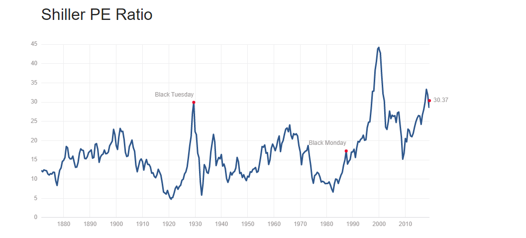
This is a chart of the Shiller Price-to-Earnings Ratio. It was developed by Robert Shiller, an economist at Yale University. Dr. Shiller won the Nobel prize in 2013 for his work.
What is a price-to-earnings or P/E ratio?
It is simply a metric that compares the price you pay for an investment with the earnings that the underlying business produces.
Since the prices you see in the stock market are quoted on a per share basis (for example, XYZ Company has a stock price of $15 per share), the price-to-earnings ratio shows how many dollars of company earnings each share of the firm is entitled to.
Very simply, the price-to-earnings ratio shows you how much value you are getting for each share purchased.
To overgeneralize, a lower price-to-earnings ratio is better because that means that you are buying more earnings for each dollar you invest.
Of course, in practice, there may be good investments trading at higher price-to-earnings ratios because the company is growing fast enough to make its *future* earnings a bargain at the current price.
So, it’s very important to remember that when you buy a business or a stock, you are buying decades of future cashflows.
This is what really matters: the long-term stream of cashflows generated by a business.
Back to the Shiller Price-to-Earnings Ratio:
The Shiller price-to-earnings ratio chart shows that the U.S. stock market is trading near the highest valuations in history. In fact, the only time the Shiller P/E has been higher was right before the 1929 stock market crash and during the dot-com bubble that ended in 2000.
From 1929-1932, the stock market declined 90%.
From 2000-2002, the market declined 50%.
I believe history will repeat itself because the stock market is grossly overvalued.
What does the Shiller P/E measure? Instead of dividing the current price of the market by the previous year’s company earnings, Dr. Shiller’s metric incorporates the last 10 years of earnings.
The reason 10 years is used is because this longer time period includes a complete business cycle of recession and expansion.
It includes high earnings in boom years, but also factors in lower earnings during recessions.
This way, an investor will get a clearer picture of the profitability that companies in the stock market can *consistently* generate.
This is key. Remember, what matters is long-term cashflows over decades. Not a great period during boom years. Or, a bad period during a recession.
Therefore, it’s important to analyze what a business will earn during the full cycle, not just its peak earnings during boom years.
If the chart from Dr. Shiller was not bad enough in showing how overvalued stocks are, Dr. John Hussman of Hussman Funds improved upon the Shiller price-to-earnings ratio and shows the situation is actually more dire.
This is his chart, which shows that stocks are trading at roughly 45 times their average margin-adjusted earnings over the past decade (the highest level in U.S. history):
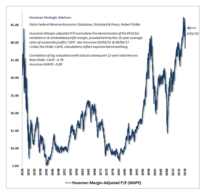
To put that number in perspective, this means that it would take 45 years to earn back your current purchase price if earnings stayed constant.
Contrast this to the metric in past bear markets, where the MAPE was only 15 or 10, or even 5.
Going from a MAPE valuation of 45 to 15 would involve catastrophic stock market losses.
And, this isn’t a rare event. It routinely happens during recessions, which come along every 7 years or so.
How does Hussman’s metric compare with Shiller’s?
A flaw in the Shiller P/E is that it does not account for the current level of corporate profit margins.
Corporate profit margins have a strong tendency to revert to their mean or average level.
This means that above-average margins have a tendency to fall and below-average margins have a tendency to rise.
If you are buying when margins are above average, the tendency of those margins to decline will be a significant headwind that will typically cause corporate earnings to fall.
If you buy when margins are depressed at below average levels, it will give your investment a significant tailwind, because increasing margins will cause earnings to rise even faster than normal.
So, Dr. Hussman found that adjusting for current corporate profit margins made his “MAPE” or margin-adjusted price-to-earnings ratio even more accurate in predicting the performance of the stock market.
While the basic Shiller P/E has a -0.78 correlation with the market’s subsequent 12 years of returns, the Hussman Margin-Adjusted P/E has a -0.89 correlation.
A perfect -1.0 correlation would mean that the market was perfectly negatively correlated to a metric. Meaning that the higher the metric, the lower the future stock market returns.
In statistics, a -0.89 correlation is one of the strongest relationships you will find in the real world. So, it shows that Dr. Hussman’s metric is really very accurate.
However, it is not a short-term market timing mechanism. Markets can remain overvalued for several years.
This is good news though, for those of us who are not interested in trading the market for short-term gains but investing for 5, 10 years in the future or more.
What does this all mean for an investor trying to invest money in 2019?
It shows that the market is in very dangerous territory. Not only do these high-level indicators from Dr. Shiller and Dr. Hussman show stocks are in an enormous bubble, our individual company by company analysis at Frank Capital Management confirms this as well.
We believe when the bubble bursts, a -50% decline is the base case, with losses possibly exceeding -60% in a worse scenario.
This means a $100,000 investment in the market becomes $50,000 or $40,000. After a loss like that, just getting back to breakeven on your investment could take many, many years.
There are many factors that have driven the market into uncharted bubble territory. I will write more about them in future posts.
